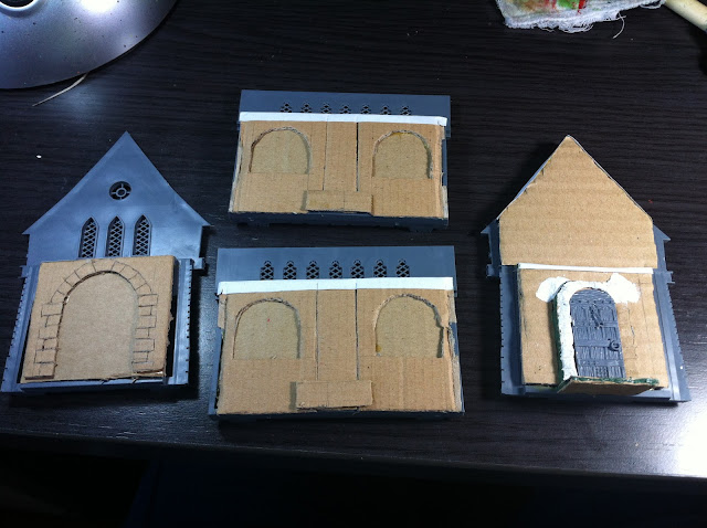
You saw lots of unfinished scenery in last week's battle report. It's time to solve that. Let's begin with the tiny building, the ubiquitous GW Chapel.
GW's Fantasy scenery has become really popular, some of their kits being among the most used in all kind of wargames, from fantasy environments to medieval or even Victorian/VSF/Gothic games. High quality and detailed kit, I must say, it's a very good choice for scenery.
However, that's exactly what moves me to do something... different. I just don't want to have the same piece of scenery that everyone has. At least not the very same one. But... how to make the difference? I mean, in a cheap and easy way, something that anybody with my lack of skills could reasonably achieve. Hmm... Then I found the solution. As the title says, beauty is in the inside :P.
That's it, I thought it would be fun trying to make something with the inner part of the kit. Unfortunately it's too small for real game action, but it can be used as part of an scenario (the character has to spend 1d3 turns in the inside looking for the secret escape/treasure/whatever... Don't know, this kind of stuff). As you can see, no complication on my part, just plain card and let's see where this leads.
I thought of doing something with all those skulls. Maybe opening a window instead of them... something. But that would be on the 'complexity' side I was trying to avoid in this project, so I finally just left them. You know, it's not GW if it doesn't have skulls...
Some more additional work in the inside:
 |
| Problems with the finishing touches, but I'll be solving that |
So my idea is having an altar -or more likely a statue (from the same kit) at the end of the chapel and some frescos on the side walls. I'll be showing you my progress on this over the next few days!


It has a very large project that you attack you, I feel that this will be a unique piece, I will follow the evolution of your work my friend
ReplyDeleteCheers
Vincent .
Thank you very much, Vincent! It's a small piece, but I think it can still be challenging!
DeleteI love GW's scenery and have always found it comes into it's own when you add (or take away...) a few details. In the past I've dealt with those extra skulls by drilling them out to make angled 'drainage chutes', replacing them with Mordheim gargoyles, carving battle damage in their place, replacing them with selected zombie heads or angst-ridden human heads from various sprues and even the occasional green stuff birds nest! I really hate those skulls, I recommend using a Dremel on them! It's very cathartic! Even if you just take care of some of the skulls it has a dramatic effect.
ReplyDeleteGood luck, seems like you are taking this project in an exciting direction!
Haha, right, that excess of skull really becomes annoying. I don't mind a few, but this ossuary becomes a little bit creepy.
DeleteHowever, I plan to make quite a quick work, as I have tons of pending scenery and minis! :S Not sure if I can manage to remove the skulls at this stage, but for sure I have noted down your tips! If I like the final result (and it's likely I will), I most probably get some more scenery this kind, so I'll begin 'Operation Skullchopping' :D
Thanks a lot!
My pleasure. Can't beat a bit of strategically placed vine foliage to hide a few skulls if you're in a hurry. Looking forward to seeing the interior come together.
DeleteHmm, interesting... I'll explore that idea! Thanks!
DeleteDid the roof fit in the end? :P
ReplyDeleteOh, right, you saw that this one has some assembly issues! Don't worry, I'm stubborn enough to make it fit :D, you'll see, you'll see...
DeleteNice. Very nice. Looking forward to seeing this finished.
ReplyDeleteThanks! I'm aiming for something slightly different than the ordinary plastic kit, let's see where does this lead!
ReplyDelete