At some point I decided this was going to be a good idea. Don't know when it was. Well, too late for regretting :P.
This is what I got:
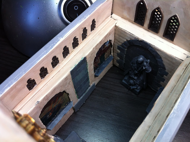
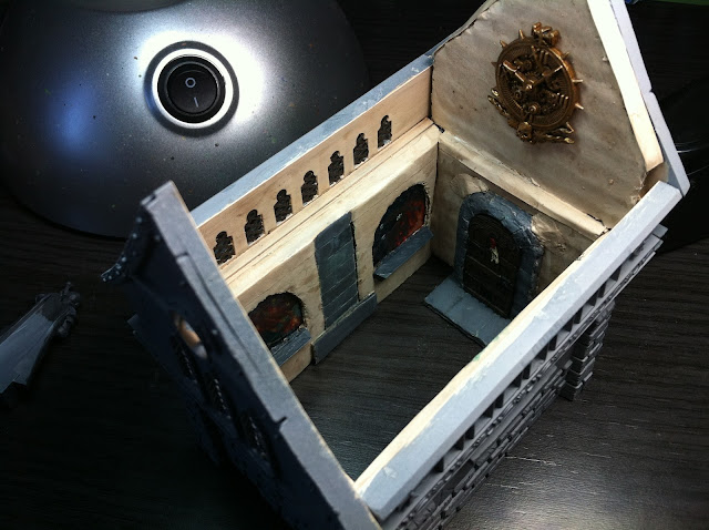
No joking, having those skulls on the outside walls made me think about the general lookings of the piece. I thought it was appropiate to keep the gloomy aspect. No peaceful, colourful icons would fit in here. That's why I chose dark medieval looking frescos, going for the apocalyptic way. I hope it doesn't look too macabre, that's not my intention, but I felt this was the most correct way to approach the project.
Dark images, fire, destruction... I have kinda mixed feelings about that. Though being 'correct' in this 'medieval fantasy with skulls' context, I think they look too dingy on the whole.
I still have to work on the finishing, of course, but this will be more or less the preliminary aspect of it. When you assemble the walls, the chapel looks like this:
 |
| I believe the statue concept suits well the chapel |
 |
| Maybe too pretentious clock, but it fills that space and I don't have to paint another fresco |


Looks great, the whitewash of the walls themselves prevent it from being too gloomy. I like the idea of the congregation having a loud, ticking reminder of their impending judgement on the wall too!
ReplyDeleteNice work so far. Great idea with the Frescos and they are nicely done. Look forward to seeing the finished result.
ReplyDeleteThings are moving very well, I looking forward to see more
ReplyDeleteGreetings
Thanks, pals! :)
ReplyDeleteI'm still unsure of what to do with the skulls on the outside, I'm looking for 'vegetation' to cover them, but I'm still not happy with what I'm achieving. I'll let you know how this evolves!