08/05/2016

Punkapocalyptic: Junkers

Here we go again! It has been kind of a rough week in painting terms, but I've managed to finish my other Punkapocalyptic band.

The 'Junkers' have quite a notorious steampunk vibe. As the very word gives a hint, they are scavengers for all kind of stuff, the older the better, and live in a nomadic way through the Wastelands.
Most of my work here (as happened with the other band too) was done every so often while rocking a baby carriage with one foot and listening to children songs on Youtube; so I really hope you please indulge me. Multitasking is proving challenging.

Enough of that. Let's go for some pics!

Again, not as colourful as the 'official' brushwork
I tried to depict a dull green uniform, just as if she was wearing some king of WWII style military outfit. So I didn't deem appropriate the use of bright colours, but just a regular uniform and a dirty shirt. My other possible approach was mechanic overalls, but the ushanka she's wearing led me that way.

For the next one... Well, I honestly could only think of Dum Dum Dugan :D. I just explored the cliche and let it go towards this:

More kind of a Victorian dock worker, but, hey, it suits the mini
The diver guy was trickier than it looks at first. Just a couple of quite plain colours and that's all, yes... but precisely there lies the trap! I struggled a little to make it less plain and help some shapes stand out, but I just got this:

Can you imagine how the poor guy must be sweating inside?

 The electrical stuff guy is an interesting mini. I humbly think it's too stiff and hieratical, and a better pose could be made up for the man, but the gear he wields is steampunky funny (though the awful pic below won't let you get a proper idea, sigh).

I need to make a WH40K Ork into this outfit, seriously

I wasn't happy with any colour scheme I was thinking of for this lady. I felt that she needed a brighter appearance than the rest, but that would look odd among all the other minis.I finally came to this compromise.

Still unhappy, really needs some additional work
The last one is simply for fun, you can see there was little need of choice of colours:

Though I could have painted him green, not red. That would have been unexpected!
The mandatory group shot:

Gorkamorka for humans
As I was painting the minis a thought came to mind. The other band is made of half naked people while in this one everyone looks quite ready for chilly weather. Hmm, quite unsettling :P

Well, now I only need to find the time for a game. I've heard quite good things about the rules, I'm looking forward to giving them a chance!

30/04/2016

Punkapocalyptic: Gangers

New project ahead! Oh, come on, you really didn't expect me to keep on track and focused on anything, did you?
Some time ago I backed the Punkapocalyptic KS. Not only the guys behind are the friends of a friend, but the minis looked seriously appealing to me. You may want to have a look at their web, for they have some pretty cool stuff (including the rules for download).

I got two bands, Gangers and Junkers. Gangers fall into the classic 'Mad Max' post-apoc vibe. I took a darker approach than the 'official' paintjob. Still not sure it that was wise on my part, as they now don't stand out as much as I woud have liked. Anyway, here you have them:

You thought the name Punkapocalyptic was for nothing?
Badass is the troop type. Nothing else to add, your Honor
The boss. The back banner should give a hint
I made a slight conversion on the mini above. It came with a shotgun on her right hand, but the mini came damaged over the post, so I replaced the whole hand with this other one with the crossbow, which was an alternate weapon for the Badass above. I tried to make something scary for the banner, but failed. The original idea was a demon skull (yup, those should be little horns), with flaming jaws and the radioactive warning sign instead of eyes. All I got was a freehand that looks like a guy on LSD, what can I say. I tried.

OK, let's go on. This one is the brute of the group.

Fun fact. The front armour is a sewer top from the town of Gijon (where the game developers are from!)
Utterly unsatisfied with that one, too dark. I may repaint the armour in a brighter colour.

More. I wanted to avoid the obvious Green Arrow reference, so I tried this:

Green Arrow? Nay, I'm post-apoc Legolas!
Now, I get the Kratos reference too, but I'm not into video games and have never played the God of War franchise, so I fancied to do something different...

Is that a Wh40K Tyranid?
Well, after these horrible, dark individual pics, just a horrible, dark group shot:

The band!
All the bases are pretty plain, maybe too much. As they depict some wasteland, I haven't added any grass or anything, but just this scorched aspect. Maybe I could add some yellow spent flock, hmm.

Anyway, this is it, I still have the Junkers. More incoming soon!

25/04/2016

RT Bestiary: Enslaver

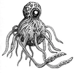
I cannot get tired of repeating how such awesome people you can get to meet into this hobby. I have received several minis from friends along the years, and I myself as well have given away some; karma keeps flowing, whatever. But today, well, today I bring something totally different. My pal Rinahe (generous donor for some of the coolest stuff I had here in recent times!) took the following step and decided to sculpt a RT beast out from scratch just for my own particular bestiary. Wow. Just wow.

He chose to do the mythical Enslaver, back from the pages of the Rogue Trader manual.

No, not the flying spaghetti thing


Enslavers are psychic creatures that dwell in the Warp, coming to the physical realm to... well, enslave other beings, make them act according to their will and feed over their minds. For a more accurate description, I always reccomend Lexicanum.

Please let me show the sculpting process my pal went through. He took a walnut as a start point. Right. A frakkin' walnut served as inspiration and main body:


First shapes are given with DAS putty and the tentacles come from another (rather awesome) project he is carrying through right now.


For me the process is quite amazing. I mean, he insists to say that it's not like sculpting human faces or stuff like that, but I must give him the credit of having an idea and executing it in a way I hadn't expected!


So OK. I was given this glorious beast. I was officially in awe. A big thanks, man!!
Now over my shoulders came the responsibility of making justice to this insidious Xeno. Glups!

-Did... did you hear something, Bill? -Nope, man, relax, just the wind
According to classic fluff, Enslavers can change colour, but they usually are leather brown, with lighter tentacles and the so-called eye (though not really being an actual eye as we humans understand that organ) can be red, orange or purple.

Weird mutant octopus
Your mind belongs to meeeee...

'Yessss... kill all the huumans... Oh, erhm... and bring piiizza'
I really think the sculpt catches all the vibe of the original design, it's enormously great, and a real pleasure to paint!
Now I think it also provides a really interesting element for any scenario, so... I have to come up with one! The creature commands, we obey!

20/04/2016

Colour up the town

Time to bring some colour upon the crazy big building I showed you last week. Ehm. Well, that colour will be mostly dark grey. Ahem.

First step is just spray it all over. I also created some dirt effects and stuff with different sprays. In the pic below you can see I also had hand painted the window frames.

Looks like a cozy place to live in, sure
The process here is really very simple. I painted the windows (I had to use a darker tone than usual, as the building was asking for a gloomy, dready aspect) and added some pretty basic graffiti. I also used some street signs and ads (I got them from the internet ages ago; I've been trying to source them back again and I haven't been able to do so. If anyone knows where these came from, I'll gladly credit the guy who offered them; thanks!)

Roughly 30x30cm. About 20 cm high

Bulky stuff indeed!
The tiny stuff is what really makes any project come true. So I think it's worth of trying to add small details here and there. You have to reach a balance point, of course. I'm not trying to recreate a perfect, movie-standard reproduction of anything, but just to achieve an interesting piece of scenery, above the dull ubiquitous ruin-stuff.

The compromise between quick'n'cheap and some appearance
A touch of colour!
Let's go for some close-ups. The archway stairs:

Gloomy!
I also added some wiring. Not as chaotic as I intended, but I'm learning and will hopefully improve in the future. I tried to show some messy electrical stuff over the streets. Just my first experiment.

I'll be needing some more meters of that!!
I also added a religious icon over the arch (from the Bretonnian command group). It enhanced the medieval aspect of it, a Saint's image over the entrance; you can find stuff like this in several actual medieval gates and I thought it wasn't out of place.


Eclectic, yoou may say
Urban art and graffiti also played a role here, that's the modern-ish approach here.

Bloody Eagle. Imperium is not that well perceived here...
An Arbites. Ha-ha. So funny.
Colour? Someone here is... happy? The Governor will not suffer that!

A few posters come from this wonderful NASA link. Right, a number of retro-futuristic images, totally delightful. For example:


You may have noticed another ones, more WH40K specific. I designed them, thought it would be fun. I had to make an English version (so the pun was recognizable) and then a Latin Gothic translation, as it seemed logic that the Imperium printed this in the official language:


Well, so this is it. I've learned some things about what to repeat and what not to do ever again, hehe. It's been a fun project, so I pretend to do some more buildings in this fashion. But first I still have to attend the lead mountain!

14/04/2016

Boys and their toys

Time for some Star Wars love again. I've picked a relatively simple endeavour, the E-Web engineers. There are just two of them, so I could leave one as it is and convert only one mini. Besides, it's all black and white, so there won't be that much work! Laziness, I hear you scream? Meh, I prefer time & resources optimization :D :D

So there we go. The first one is the untouched one. Just as it is:

Pew, pew, die you rebel scum!
Have you seen the size of my gun?

The thing about converting the other mini is that I honestly didn't know where to start. I mean, it's a guy shooting his gun, what could I do? I took the easiest solution, I put him at ease, proudly posing for an Imperial propaganda poster :D

Enlist now. The Empire needs you.
You can see this involved quite a reposing effort, hehe. I had to cut every limb out from the poor guy and fix all his articulations. I'm unhappy with his right knee, but I'm not redoing any work for the moment.

Stop posing and help me over here, man!
I still haven't even opened the rulebook, but as far as I'm concerned, I think it's important to make differences between minis for gaming purposes (some kind of Descent like stuff, I've heard), so at least these two meet that requirement!

I'm uncertain of what will I take on next, as usual, but I'm on it!!

11/04/2016

New urban planning

One of the things I was missing on my urban board was some chaotic nature in the city development. I mean, I have a number of beautiful MDF buildings (and some more still in their boxes awaiting for the moment to come!), but they all share a feeling of, I don't know, maybe 'order'. I mean, they offer me sound volumes, perfect shapes... If I painted them in a delicate, clean way, they would no doubt fit in a more elegant setting. But I was looking for a more shanty town look, though not exactly that. Confusing, I know.

Then I realized that in fact I already knew what I was really looking for. Not a junktown. I was looking for a medieval sci-fi town. Let me elaborate. The interesting thing about this board would be offering an intrincate labyrinth of crossing streets, walkways, different heights, that kind of stuff. I wanted to give the impression of uncontrolled growth.

My perfect example would be the Italian town of Sanremo. I had the chance to stay there for a couple of weeks some years ago and the old town, La Pigna, totally represents what I mean. A maze of streets going up and down, buildings towering over more buildings... there is an intrincate beauty in that, seriously. Just google some pics of Sanremo La Pigna.

Yup, this is just a street
Turn this into retro sci-fi and you got it
Have I disgressed enough?

OK, of course such a thing is out of reach for my skills, my board and my... everything. But yet I could do some stuff and make the difference with my previous MDF buildings. So, with a box and some foamcard I begun to create some shapes...

It all begun like this...

...and then it turned into this
The addition of the second tower didn't really please me, but I only saw that once it was assembled. It was a little too much, but it was a way to make this on the rear part:

Not actually functional, as there is no inside, just for the show
I begun to make some additions to somehow disguise the bulky appearance:

I first thought of a walkway, but I changed my mind to the roofed version, looked more like what I was looking for

The rear part needed some stuff too, but nothing so large:

That red box is an empty air refreshener :D
It adds an interesting shape, I'm definitely using more in the future
Those weird ledges will have their function, it's in my mind, hehe...

So, once the main body is defined, it's time to think about the details:

Doors from RoeBeast's Trash Bash Kits KS, A/C units from Euphoria Miniatures
Details! More details!
So this will be more or less the final look
I'm trying to achieve a mix of that medieval flavour (messy buildings with no order) with a low-tech scifi setting, which I think I must favour above the former. Maybe it's too bulky, that's my main regret/concern about it, but well, it's done and it is what it is. I still have to see how it looks once painted and on the board.
But for the moment it's quite a start!