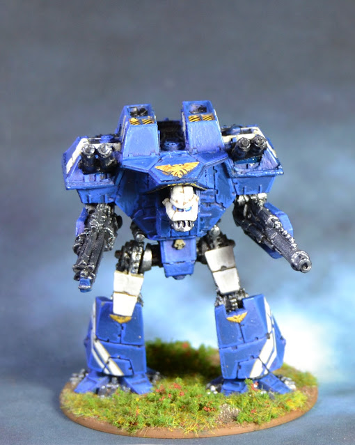
Back to Epic for a moment, while I keep sustaining all the other projects open :D
After painting the Imperator Titan, I just needed to put my hands on my Warlord, that was quite a natural step. It's the new model, the one released for 3rd Ed. It for sure goes quite far from the original Warlord design, it's all square, full of rough angles (similar to the metal one that was released, but somehow improved) and in some sense I believe it reflects how different were the guys at GW trying to get from the original models, aiming for a more tech-techy approach (if it's evident for the Imperial designs, you just have to have a look at the Eldar Titans! Wow, those were a change!)
Anyway, I think the Lucius Pattern (as that particular line was later known) works nice on the Warlord. Lucius Pattern Reavers don't look as good to me, but Warhounds were a qualitative leap from the original ones. But I disgress. You are here for the minis, so let's go for that. I stripped the model and started it over again.
Anyway, I think the Lucius Pattern (as that particular line was later known) works nice on the Warlord. Lucius Pattern Reavers don't look as good to me, but Warhounds were a qualitative leap from the original ones. But I disgress. You are here for the minis, so let's go for that. I stripped the model and started it over again.
 |
| Back in black |
As I had chosen blue as primary colour and white/cream as secondary on my Imperator, the choice was easy here. What wasn't that easy was where to put what. Being that different in concept from the Imperator, I couldn't simply paint random pieces in random colours. I chose this approach:
 |
| Mimicking my big brother... |
Then I thought of adding a couple of white stripes on the blue background. That would be respectful with the scheme and also would emphasize the more industrial/modern feeling. After that and a couple of other pieces in white, this is the final result:
 |
| Yeah, I'm wearing an Adidas sweatsuit |
 |
| Neighbourhood's mine, bro |
 |
| See me walkin' |
A beast like this needs a name in accordance. I chose Bellator Rex, 'Warrior King'. Being a Warlord, this Titan will lead most of the offensives of the Legio, the Imperator taking part only in the most desperate battles. Here you can see both brothers:
 |
| Blues Brothers... I mean... Blue Brothers |
Well, so now I have two Titans. Still far from an operational battlegroup, but you can bet I'm working on solving that... ;)

From that era, this titan is probably the only one I sort of like, all the other ones are absolutely catastrophic to me (Orks are just shitty squares and eldars are totally negating all grace and style, I just don't understand how they coul dbe released to replace the Goddwin versions).
ReplyDeleteYou prove a solide paintjob can tie models together so my congrats for doing that !
I totally agree, the change in the design is quite inexplicable to me. I guess they wanted a new approach, but the replacement of curves for angles and squares made them look quite awful. Eldar stuff suffered particularly, those abominations were terrible. But right, Ork Gargants became cookie boxes, ouch.
DeleteI still have lots of stuff ahead, I'll try to keep the spirits up!
Great result Suber. I love it especially the white stripes. How did you get it to be so straight? Did you use masking tapes?
ReplyDeleteHey, thank you! I really didn't know what to do to break the all-blue monotony, and I finally found this solution. It maybe pushes the mini towards the Anime style, but I think it works for this one. The surface is not that large, I did those just freehand. Thank you!
ReplyDelete