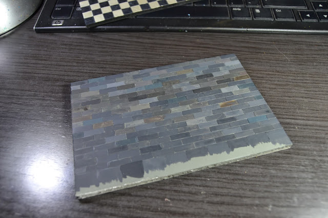
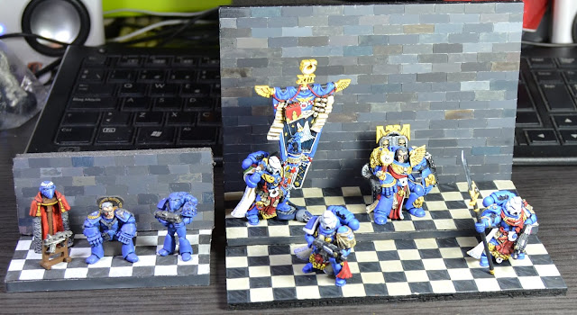
Time to put this project to an end! With all the minis finished, I just had to take care of the hall itself. I could make this as easy or as complicated as I wanted. If you know me you already know the answer... The easy way it is :P
I was suggested to use some wooden pieces as columns and stuff. The idea is nice, I got it under consideration, but that would have forced me to design some base for them. Naah, just these pieces of foamboard, they'll have to be enough...
Trust me, I know what I'm doing. Not only it is easier (which it is!), it also gives all the visual attention to the minis. So no tapestry, carpets or anything else. I'll just keep it the way of the original vignette.
For the floor I just repeated the checkered pattern I used for the original vignette:
 |
| How about a nice game of chess? |
The same goes for the wall:
 |
| Another brick in the wall |
OK, now I faced a problem. The standard bearer has quite a pose. His left foot is on a piece of rubble. I thought I could save that part using two levels on the floor, but the piece of foamboard is way too high for that. What could I do then? Well, use your imagination, Suber, use your imagination...
 |
| The skull comes from the Scouts kit, I believe. The rest is just greenstuff |
Right, a Genestealer corpse. Why oh why, I hear you wonder. The illustration of yore (WD 97?) shows Tyranids trophies on the room:
 |
| We can skip some details for this vignette... |
So well, I thought it could be appropiate, and honestly, I couldn't think of any other motif to justify that standing pose :D
So the vignette finally looks like this:
 |
| We are posing for the cover of our new album |
You can compare both the original and the reinterpretation:
 |
| Man, it's the same vignette but on steroids! |
Well, this is all I have been able to achieve out of these minis and my skills! It's been a fun process, I must say, from the inception of the idea coming out from the dead marine to this vignette with four converted minis. I think I could have added some more stuff to the wall, it looks too plain. But for the moment I will call this complete and move on other projects. Hey, you never know, maybe in a couple of years I make another reinterpretation and recreate the whole throne room and the Fortress of Hera :D


I love it tons ! You really get in that final picture the whole difference between RT and modern 40k I think, talk about scale creep !
ReplyDeleteGreat work and very brave attempts, I know I wouldn't dare attempt projects like these. I'm impressed.
Thank you very much! I've been told that the stone wall devaluates the vignette and that I should have tried the marble approach instead. It kinda makes sense, so I may still rethink this stuff again. It definitely needs something on the wall; banners, trophies or whatever. All in due time then...
DeleteBrilliant!
ReplyDeleteThank you! Glad you like it! :)
DeleteI've got a soft spot for the original vignette. You've done a great job on it Suber.
ReplyDeleteWell done man :)
Well, thanks, I believe both of them are really different yet similar. Quite a metaphore of old 40K and nowadays 40K. Bigger! More minis! More everything! :D
DeleteExcellent work dude!
ReplyDeleteThank you! As I just told JB, I may put some extra work on this in the future. Time will tell...
DeleteGreat job Suber. The chequered tiled floor really has a lot of presence, without overwhelming the miniatures.
ReplyDeleteI know you've already commented that the rear wall is a bit plain, and I agree that some extra detailing would be worth the effort. Some cables from the back of the throne and along the base of the wall would be a fairly simple addition. As would a pillar on the right of the diorama - this could balance out the banner.
That said, the diorama looks great even without any further work.
Thanks, Jon! I cannot but agree, it needs "something" behind. Maybe it's just as simple as adding cardboard painted as marble, and then some trophies or stuff. The cables idea makes sense, I may try that! Thanks for the ideas!
DeleteThis looks really good mate! I love seeing the modern and RT versions side-by-side!
ReplyDeleteThank you! Kind of a way to see the evolution of WH40K! :D
DeleteLooking awesome dude! Topjob!
ReplyDeleteThanks! I have enjoyed the silly process, and I may as well keep on working on it! I think it was Kurosawa who said that a movie is never finished, it's just temporarily abandoned by the director (something like that, I believe). Well, I could say something way too similar about my projects! :D
DeleteThat look brilliant.
ReplyDeleteI remember the original picture and hoped you would include the dino's. Still looks really cool but I REALLY wanted the dino's!
Haha, those were the original concepts for Tyranids back in the day! I think that those later on evolved into the Termagaunts. I may include more Tyranyd stuff whenever I take this project back again!
DeleteThank you!
You've outdone yourself. Seriously. Not only is it fantastic modelling and painting, but I love the fact that you've juxtaposed the old RT aesthetic versus a modern interpretation.
ReplyDeleteLike The One, I have a real soft spot for the original diorama. There's something about the understated yet stiff posture of the models that reminds me of those really old photographs, where the subjects had to remain still for a few minutes before the image would settle on the plate.
Two big thumbs up!
Thank you very much! Haha, I like the idea of the photographs of old :D The new mini of the boss lacks that formality, but hey, given that it comes from a corpse, it's quiet understandable :D
DeleteVery impressive Mr Suber,
ReplyDeleteI can't imagine a finer interpretation of the diorama, and I have seen a few, any chance of the mentor legion diorama being replicated?
Just kidding, again great work!
Wow, thanks! Oh my, I cannot recall that Mentor diorama! Any chance of a link? (Brrrr, cold shiver...) :D
DeleteWow I love this, so good to see classic illustrations bought to life through using our miniatures to create dioramas. Excellent stuff and great problem solving along the way too!
ReplyDeleteThanks, it's quite an enjoyable process all way long, silliest ideas tend to be the funniest to turn into a project! :D
DeleteQué preciosidad... Aunque no tengo claro cuál me gusta más de las dos... Probablemente algo a medio camino :-D
ReplyDelete¡Gracias! Es un proceso cachondo, cada uno tiene sus pros y contras, jeje, pero en general hacer dioramas es divertido :D
DeleteBeautiful work.
ReplyDeleteThanks! Making these vignettes is fun, it opens doors to reinterpretation and experiments, it's nice; but I have to stop, or else I'll crowd my home with this kind of stuff! :D
DeleteLove it! Nice work Suber, better than the original ;-)
ReplyDeleteThank you! Now that a few days have gone by and I see it on the shelf, I really see how much it needs something on the background. Need to solve that!
Delete