A short project today, kind of a palette cleanser before I get back to larger stuff.
I was a proud backer of Curis' Röknauts Kickstarter, which has brought Squats back to the front line in the most classic way imaginable. It is funny, I never was a big fan of Squats back in the day, and never collected them. But there was something in these minis that called my attention so bad that I had no real decision to make, I really wanted a bunch of Space Dwarfs.
In terms of design they are somewhere past the Rogue Trader days and into the Red Era vibe, and maybe that's what caught my eye, as I feel quite comfortable with that stuff. Of course I wanted them to look in that fashion, so no dull colours nor earthy tones. 90's glory FTW!
The thing is that I got so excited that I forgot to take pics of the main part of the painting process!
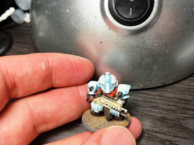
Of course there was no point in even trying to mimic Curis' paintjob or emulate his skills, so I chose my own path. I primed them white (bold move!) and chose white for the armour and a light turquoise for the flak vest.
 |
I first remembered to take pics when I had gone this far
|
White can be challenging! The shade is a mix of Ice Blue and Grey, and there are kind of seven to a thousand layers of increasing white to the mix in order to get a convincing 'false white'. Of course the pics are burnt and nothing can be seen, but I have inner peace, and that's all that counts.
 |
I had to do the bases before I glued the minis on them!
|
I guess you can immediately see the problem with these. They are too white! Too empty! My horror vacui didn't allow me to leave them so immaculate. So how could I make them look like the vertically challenged space Vikings they are supposed to be?
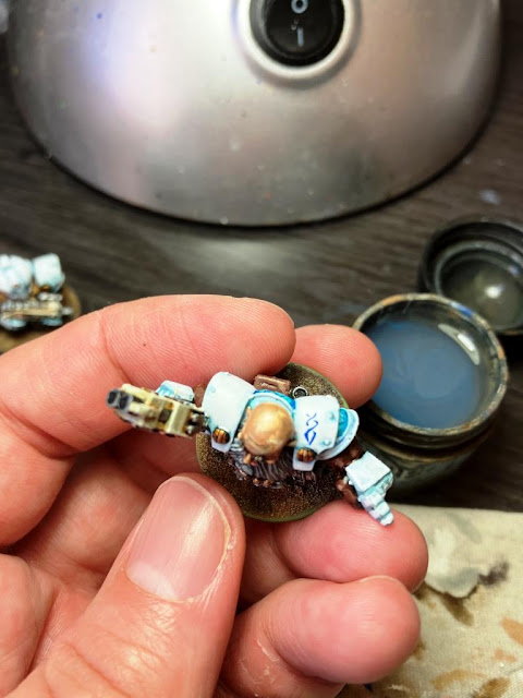 |
Easy. By painting fake Viking stuff
|
 |
I wanted that to be a crow's head and a symbolic lightning or something. Depending on the viewer it can be an eagle or maybe a monitor lizard. Still uncertain
|
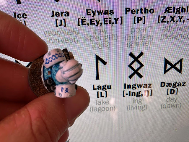 |
I don't know a thing about runes. Lagu Ingwaz. They live next to a lake or something. Hence the turquoise
|
If you are wondering, yes, of course I'm making this up as I paint.
 |
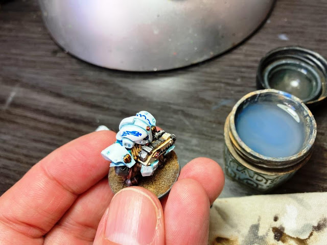
So this is taking shape
|
I didn't want to repeat the animal theme on the other half of the helmet, so I tried a different approach:
 |
Yellow... stain. Not particularly taking risks, I'd say
|
 |
Oh. But why. Why am I doing this to myself
|
 |
Biggs Darklighter called. He wants his spare helmets back
|
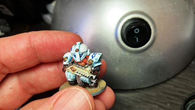
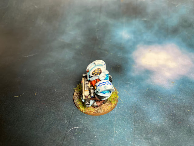
I don't think I've ever highlighted such small checkers before, but it's not Oldhammer without them, it is law!
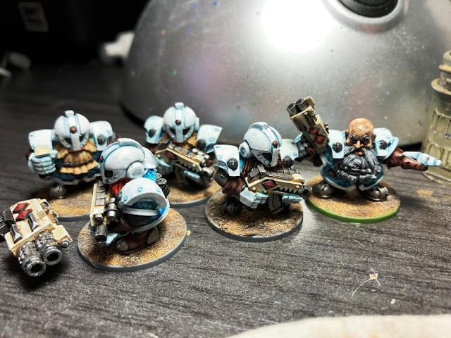
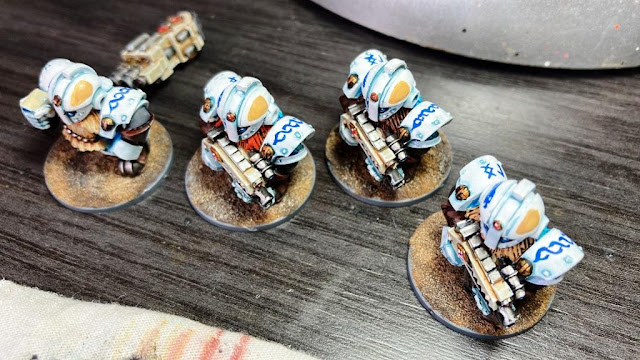
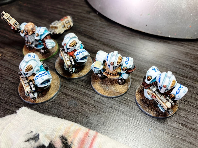
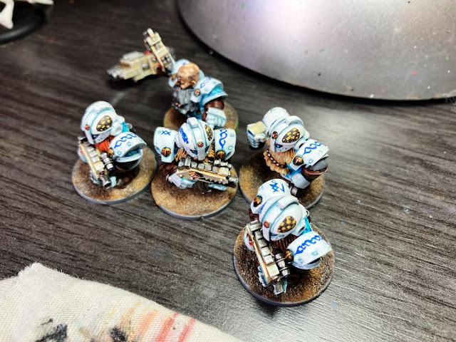
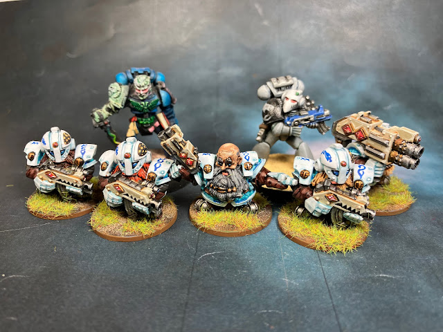
So here you have them finished!
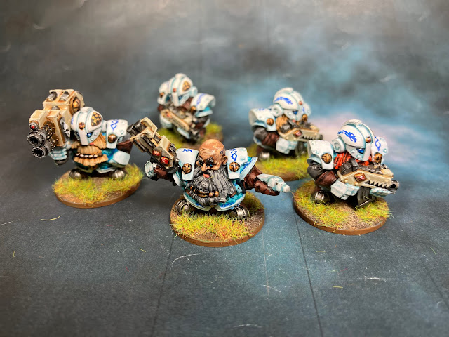 |
The Röknauts rock!
|
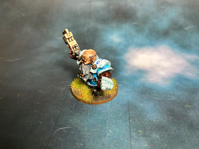 |
The tattoo on the temple was also unnecessary. But you know. It was a little necessary
|
 |
One side
|
 |
The other
|
How do these fellas scale up with other minis?
 |
Alongside the Universal Unit of Measurement
|
 |
That Commissar is looking at them with some eagerness
|
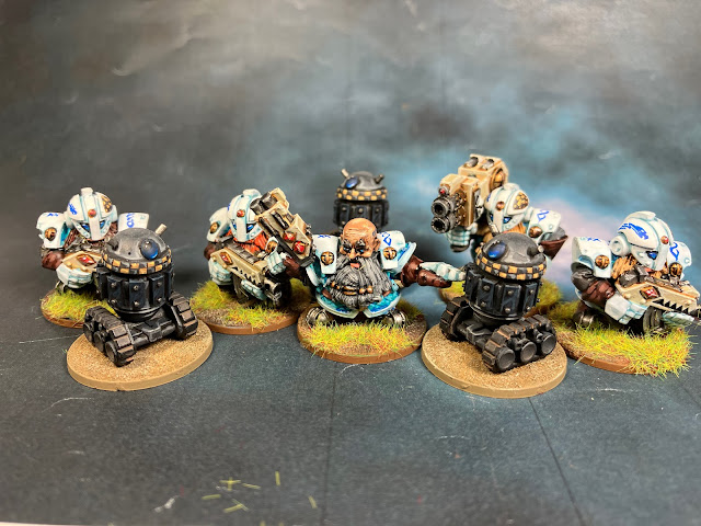 |
Oh, even the Bombots are taller!!
|
Who would have said that I would start collecting Squats at my age! Yet here they are. I believe they are a one-shot project, at least for now. Future will tell, but now I still have many more projects calling for my attention. I hope I'll be showing some of them soon!


Holy heck but I love these! I vaguely recall the ks, and now regret not jumping on board.
ReplyDeleteWhite plus blue/turquoise is an inspired choice and your free hand designs are very fitting and well done indeed.
I really do hope we’ll see some additions in the future
Thank you very much! I had only painted some other Squats for a friend, and that was like 15+ years ago, so this was kind of a challenge, a first time I could say. I'm glad with the palette and I guess I'll have to use it again in the future!
DeleteOh, my...! What a fantastic looking minis mate!
ReplyDeleteThanks, pal! They keep all the early 90's flavour, and that's unbeatable!
DeleteFantastic work on the space Vikings Suber, bold colour choices worked really well, and the runes are excellent. I don't think Biggs will be needing his spare helmets, so these guys may as well put them to good use ! LOL
ReplyDeleteHaha, thanks, I'll keep that in mind! :D I feared that yellow would break the cold scheme, but I'm relieved to see it more or less works!
DeleteLove the colours that you used on these Suber, they are bang on!
ReplyDeleteThank you! I tried to avoid the classic Squats colours, so I risked a little (but only a little!). Now it's official, I do have Squats!
DeleteThey look glorious! Terrifyingly good freehand too :D
ReplyDeleteThank you! Oh, thanks, I'm glad you like the turtle head. Or maybe it's a platypus... Hmmm...
DeleteBuenísimos esos Squats y en cada charco en el que te metes, complicando el proceso de pintado, sales triunfante: tanto las runas, como el ajedrezado y la marca de la hombrera, engrandecen la mini.
ReplyDeleteEnhorabuena por otro pequeño gran trabajo terminado, (lo siento, había que forzar el juego de palabras, tratándose de Squats)
¡Gracias! Sí, me metí en un lío yo solo, pero tanto blanco liso se me hacía insoportable :D
DeleteGeniales sentadillas :D unos enanos muy majos y con un estilo viejuno muy chulo.
ReplyDeleteXD ¡Gracias! Tienen justo ese sabor de 2ª Ed que para mí los hace irresistibles, una auténtica gozada para pintar :)
DeleteI wasn't too sure about these minis but now you have some paint on them they look brilliant. Helped by your choice of colours, these have a wonderful feel about them,,,great work Suber!
ReplyDeleteThank you! These were my first Squats in like more than 15 years, so they were quite out of my comfort zone. However, this 2nd Ed vibe made them familiar pretty soon again. I didn't paint them in a Red Era style, yet I hope the colours work!
DeleteThese are really good. I like the colour scheme, especially the blue. The freehand is great. Nice work!
ReplyDeleteThank you! The colour choice came up quite in an organic way. I had seen the pics in the KS web, in red and in blue, and I knew I wanted something different, so white looked like an option. Then the light blue with a little bit of green simply popped up in front of my eyes, and then it was a no-brainer. Fortunately they worked!!
DeleteI absolutely love the armor on these guys! I've been playing around with some ice/water looks. I guess great minds think alike. You beat me to the white armor based in blues look! I can't believe how tiny those details are. Brilliant work!
ReplyDeleteNow I gotta get mine to the table!
Thank you! White was a risky choice, but in the end I'm happy with the color combo. You see, it forced me to add an absurd level of detail to avoid such blank areas, but I hope it all works!
DeleteHonestly we would never have chosen white for armour, because we are too scared of this colour; but the idea of creating a turquoise shade gives it an unexpected depth. And the blue runes turned out so well: you're turning into a real Rune Master now!
ReplyDeleteThank you! I won't lie, it was a little bit frustrating to add layer after layer to see white wasn't opaque enough, but in the end I managed to cover it all. I know nothing about runes, I guess I should have done some more research, but I was so eager to finish them!
DeleteThese are great little sculpts, and your paint scheme has really brought them to life! The white and turquoise work really well together, and give them a wonderfully icy look!
ReplyDeleteThank you! I knew I wanted this kind of cold palette, but I was quite unsure of the result until I saw it, thos white layers (and layers, and layers...) were quite a pain to achieve!
DeleteYou have put so much detail into these little minis that it blows my mine. Superb paint job Suber!
ReplyDeleteThank you! I really didn't expect to achieve that level of detail when I started them, but one thing led to another and at some point I said I had to stop!
DeleteSplendid squats and there was me remembering you saying you never really liked them! They look great!
ReplyDeleteBest Iain
Haha, thank you! Who could have said that I would end up painting Squats!
Delete