This project is going excruciatingly slow. Much more than I wanted or expected. But so is life and so are the things. At least there is some progress!
You may remember I finished the far side of the board, so now I could go into the central section. You can see it here, with the first piece of central elevation, where the future structure will be founded:
 |
| This is meant to be the main access to the upper levels |
 |
| This plastic jar will serve as a tiny tower, the road will be surrounding it |
 |
| But of course some work has to be done in advance |
 |
| This is mostly the idea |
 |
| But it doesn't look like a great idea now |
Such a big monster will distract the eye from the rest of the structure, and that's not how I want it to look like. Besides, building the support for the other end of the bridge would inevitably bring some issues regarding the slope. So I'll have to let it go and replace that with a lighter structure.
But that's a problem for the future me. For now I have to focus on the central building.
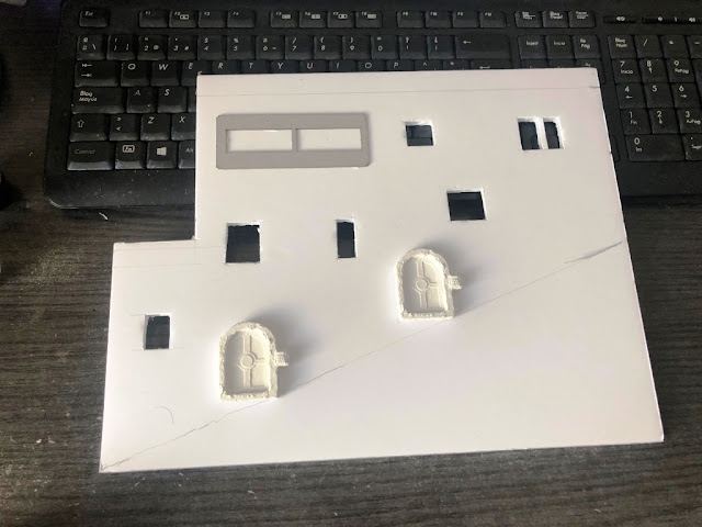
 |
| This will be the facade of the slope |
 |
| This is more or less the idea |
 |
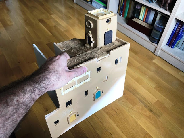
| Well, technically you can play in here, there's room for a hand... |
 |
| So let's do some work on the slope first |
You can see I used the same Green Stuff World rolling pin on DAS clay, then added some sand. The texture on the tower is mere wet DAS.
 |
| The whole structure and the facade on the slope |
But then...
Oh, then...
THEN I WAS TEMPTED
The original idea was supposed to look this way:
 |
| Original sketch (look, I already removed the stairs) |
But at some point I envisioned this other configuration:
 |
| And it also looked good to me! |
It would be a complete shift of the original concept, extending the slope up to the left of the board and creating a wide open space right in the centre of the structure, which I could use as a two-storey bazaar.
I confess I spent a few days exploring both options and weighing pros and cons of each solution. But in the end I stuck to the plan. Attractive as it was to have a wide, open, playable space, the second option really got away from what I was going to create here, the little adobe maze.
So now that I made my mind up I could start working on the front piece:
 |
| Seriously, stairs are quite a pain in the ass to do |
I thought that an arch would look good down there, and then the real door could fit inside. I could have tried a more complex shape for the tower on the left, but I think it works as it is nevertheless.
 |
| I'm going to need a lot of putty to seal those open spaces |
You can see I added the piece for the next section of the slope and textured the surfaces.
 |
| Now it all looks more or less in place! |
 |
| First coat of colour |
There is a little cobblestone floor in that arch area. Once I give a second coat of colour I can start adding details and stuff. I'm not sure of what can I put on top of the tower. My choices are an adobe demi-sphere or some antennae or things of the like, but I'm still undecided.
I have to repair the catwalk over the slope. I'm afraid that now that street is too open, so I'll explore my chances to add an arch at the very beginning of the street, giving access to the whole town.
I have not renounced to the two-storey bazaar, but now I project to place it to the left of the board. But first I'll have to finish the slope, to have a clear idea of the composition of the volumes. But first I have to finish what I have already started! Well, you know how this works :D
This is the current state of the board. I hope I can resume production anytime soon!

Slow maybe, but it's going to be amazing when it's finished! It's a big project. I think you were right not to use the bridge. I like the new configuration: it's detailed but it's a little more open than before, which works well. I hope you're able to resume production shortly!
ReplyDeleteThank you! Finding the right balance can be tricky. If you get too much into the dollhouse thing, you soon lose the point that this should be a playable board. I must keep focused! :D
DeleteTe está quedando muy bien, y el objetivo no sólo es terminarlo sino entretenerte construyéndolo.
ReplyDelete¡Gracias! Desde luego, en estas cosas el camino es tan importante (o más) que el resultado :)
DeleteHow I LOVE THESE!! Excellent!
ReplyDeleteThank you! Slow but constant progress...
DeleteThis just gets better and better!
ReplyDeleteThanks! I have kind of some rough idesa of what I want, but I think I should need quite a larger board for all of them! :D
DeleteCreo que has ido encontrándote con una serie de problemas que has sabido resolver, logrando mantener el espíritu original del proyecto y convirtiendo cada inconveniente en una nueva oportunidad.
ReplyDeleteAunque despacio, “sigues cabalgando Sancho”, qué ganas de ver la siguiente actualización del proyecto.
¡Cabalgamos! Es cierto que me van surgiendo ideas y problemas nuevos, pero lo bueno es que este tablero acepta muchísimas configuraciones e ideas. ¡A ver qué sale!
DeleteSplendid progress! Custom bespoke model making is a time consuming process!
ReplyDeleteBest Iain
Thank you! It certainly takes some time, but I have to say I'm enjoying the whole process. Seeing it unfolding before you is rewarding, specially when you see it's taking its own shape, totally far from what you envisioned in the beginning!
DeleteI love every single installment to this project, especially as it seems to grow in scale and scope with each new addition. On balance, I think I like the cramped narrow slope that you have settled on - it feels more real. Not to mention that there are options for other open spaces on the upper levels.
ReplyDeleteThank you! The somehow agonic feel is important, so that slope is truly meant to be the widest street all over the board. I hope I can still keep it playable, glups!
DeleteLa joya de la corona...una pieza envidiable la verdad. Me recuerda cada vez más a las idas de ello de la época Rogue trader.
ReplyDeleteEl caso es ese, que si se te va la mano con el detalle (callejones muy estrechos, cableados) queda "menos jugable".
Ese es mi dilema, encontrar el equilibrio entre el tablero de juego y la casa de muñecas. Porque por mí me iría a lo segundo, pero tengo que recordar que estoy haciendo lo primero :D
DeleteIt's looking good so far. So much work has to go into terrain that it can be mind boggling at times. :)
ReplyDeleteHaha, thanks! Right, you can get stuck trying to decide what to do (and specially what not to do!), attempting to foresee the final result in your mind. I promise you this board makes perfect sense in my mind! :D
DeleteYou made the right decision by sticking to your first idea in my opinion. It will look better like this in the long run, but it also means more work has to be done :D.
ReplyDeleteThanks! I agree, I hope it's the better choice. Fortunately I'm in no hurry, for I believe it's going to take some time!
Delete